This post continues the previous discussion about how I adjust shadows, highlights, blacks and whites to achieve a pleasing contrast. Some friends have been asking me about the continuation of it, and here it is!
Before we start, let me get this straight: color grading is very subjective.
People perceive and react to combination of colors differently. They also have their own taste and opinion on what’s right and wrong; about what works and what doesn’t. Their color grading goals may also be different.

What I’m going to share here is based on my experience, preferences, and goals. My color grading style, structure, choices, and techniques may or may not fit what you’re trying to achieve. With that being said, I believe you’ll get something out of reading this article.
Setting the Color Grading Goal
Before we move on, let me stop you again here and ask you this: what are you trying to achieve with your color grade?
Why is this important? Well, you need to know where you want to go, before you know how you can get there.
If you don’t have a goal right now, it’s okay. Let’s do a small exercise.
Try to find 3 pictures that you / someone else took, whose colors you really want to replicate. It is best if they share something in common so that you can easily pinpoint the commonalities. Then, try to guess why you like the colors, and try to elaborate it into words.
Use the description you came up with as your current color grading goal.
It should be good enough as a start, and as you take more pictures, edit them, and hone your skills, you’ll calibrate your goal as well. One day you’ll be like, “I want the color in my pictures to be this way, not that way!”
That day is the day you find enlightenment. 😇
What about mine? Here is something I finally came up with, after 4 years of doing photography as a hobby:
- Color consistency
- Visual pleasure
- Faithful color representation
Projecting The Goal
Starting from this point, follow me through my journey to achieve my color grading goals. I’ll share my thought process with as much clarity as possible.
First, let’s tackle the first 2 goals: color consistency and visual pleasure.
Achieving consistency and visual pleasure can be done simultaneously. To do that, I need to ensure that only certain ranges of colors appear and those colors are in harmony with each other.


Color is a general term, and in Adobe Lightroom, it can be seen as a combination of hue, saturation, and luminance.
Hue refers to the dominant color family, which is a part of a color.
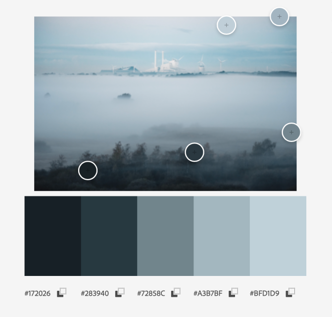
A set of colors that are in harmony with each other can be called a color palette. There are countless to choose from, but probably the most seen color palette out there, is…. *drumroll*… the Orange-Teal color palette!
The Orange-Teal Palette and Its Problems
The Orange-Teal palette is popular because it occurs naturally in many situations. Think golden-blue sky in early sunset. Also, it works wonders for scenes with human subjects.
Why does it work well with human subjects?
The majority of colors that make up the human skin come from the orange hue. And, not coincidentally, the hue that makes the most pleasing contrast against the orange hue is the blue, or more precisely the teal (cyan-green) hue.
At a glance, it seems like Orange-Teal color palette is the obvious choice. However, my personal gripe with the Orange-Teal color palette is that: they have been overused, and many times overdone.
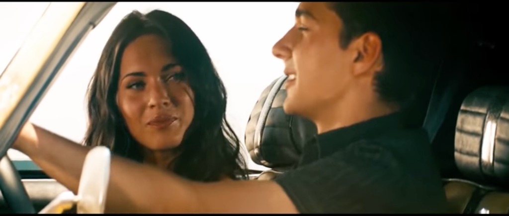
Examples below are screenshots from the Transformer 2 movie.
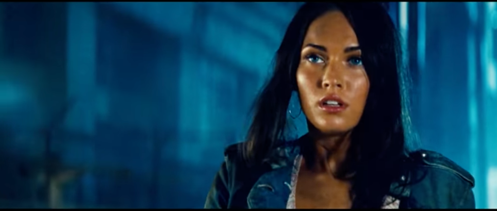


Very orange skin.
See the orange-only skin?
To me, it looks overdone and ugly. This Orange-Teal color palette implementation also the other hues too much, that they are left with only colors from orange and teal hues. The skin tone looks horrible to me.
I did a similar sin when I started learning how to edit pictures. There were mostly oranges and blues in all my pictures at one point. I noticed that, and started realizing that I wanted something else.
Over time, I started questioning my own approach: What if I used the Orange-Teal palette as a starting point, and then expand the variety of colors from there? What if I introduced other harmonious colors carefully?
At that point, I started trying to produce a color palette that is visually appealing and faithful. And maybe I could create a preset out of the settings — one that gives me a good starting point for further editing.

In this article, I am breaking the how down to a 4-steps process, each will be discussed in a section below.
- Set pleasing white balance
- Lower general saturation
- Use the HSL Sliders to achieve harmonious hues
- Use the Color Grading / Split Toning tool to introduce uniform mood
P.S: There’s another special sauce that I use to give the picture some more Oomphs, but I can’t reveal it here. Contact me if you want to purchase my preset. 😉
Set Pleasing White Balance
Setting the white balance values correctly gives a great starting point for all my color grading goals.
However, “correct” white balance may be too difficult to achieve. I would be content with achieving “pleasing” white balance, or the one that support the narrative that I want to convey.
The good news is: cameras these days are very good in setting pleasing white balance. My Canon EOS M6 II and EOS M200, for example, can calculate pleasing white balance when set to Auto White Balance.
They’re not exactly what I want yet, but most of the times they come very close.
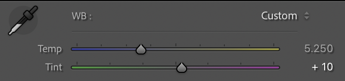
Let’s get back to setting the white balance values. As the picture above shows, the white balance values consist of temperature and tint values.
The temperature value goes along the axis of blue and yellow, and is useful to change the warmth of an image. The lower the value, the “colder” the overall image is — you will see more aquas/blues than more yellows/oranges in your picture when the value is low.
The tint value goes along the green and magenta hues. To me it is very crucial in getting a pleasing color, and ultimately skin tone. The lower the value, the more green tint it is in the picture. The higher the value, the more magenta-tinted a picture is.
Temperature
After many trials and errors, here are my typical range of temperature values:
- 2400-2800: Winter streets at night. Indoor artificial lighting.
- 3000-3500: Warm streets at night. Warm indoor artificial lighting.
- 4250-4750: Skin-tone-priority sunset or early morning.
- 5250-5500: Daylight or afternoon. Warm blue hour. Shadows of sunset.
- 5750-6250: Late afternoon. Colder sunset.
- 6500-7500: Golden sunset.
As many things in life, of course there are exceptions. Many times I find myself not following those numbers. It usually happens when I need to ensure consistency within the set, or to ensure that the picture is visually pleasing.
Tint
Before hitting our camera sensor, the light particles that go there may have bounced off many different objects. Every surfaces in your scene, especially when they’re close to each other, will influence other surfaces’ color.
Let’s use an example.
Imagine you’re taking a portrait of someone under a bushy tree. In that scenario, many light particles coming to the sensor may have bounced off some leaves before going to your subject’s skin. After bouncing from the subject’s skin to the camera sensor, the bounced light particle will contain with green and orange hues.
If the camera white balance was set manually to a 0 tint, then you would see greenish skin tone. If the camera white balance was set to Auto White Balance, the camera would set the tint to be high (more magenta) to compensate for the extra green hue.
I find green tint to be ugly for skin tones, that’s why in most of the cases I set the tint to a positive value. The very little amount of magenta tint is beneficial for skin tones: it gives the skin a very subtle touch of pink.
I love the subtle touch of pink on the skin.
Specifically, I would usually adjust the tint to around +10 to +15 in daylight situations, depending on how green or pink the scene or the subject is. In some rare situations, though, the tint can go up to +15 to +30 to compensate.
The situations are mostly indoors with artificial lighting, or close to a cool tinted windows. Those situations may not be visible at the first glance, but I usually notice it when I review a set of pictures. The pictures with wrong tint would usually stand out…


That’s when I know I need to do some extra color adjustments. And sometimes it is the tint that needs fixing.
Lower the General Saturation
Slightly desaturated pictures have their charms. They don’t come out as strong as saturated pictures, so I can admire them longer. Provided that the colors are harmonious, they will still impress me as well saturated. They also portray distant memories, and to me that’s how my pictures want to be remembered.
Lowering the saturation also limits the number of colors that a single hue can produce, and that goes hand in hand with my color consistency goals.
To desaturate pictures, there are 2 sliders in the Basic panel that you can use: Vibrance and Saturation sliders. Both control the intensity of hues; the more values they have, the more intense the colors are in the picture you’re editing.

However, there are differences.
The Saturation slider targets all the hues, whereas the Vibrance slider targets the hues that are not high in saturation. The Vibrance slider can be very useful if you want to carefully improve the saturation of a picture without oversaturating already saturated colors.
As awesome as the Vibrance slider sounds though, I rarely use it. Since what I do here is desaturating colors, I always use the Saturation slider by intuition.
I typically desaturate by -5 first, and then readjust to around -10 to -15 if needed, after the hues have been shifted around. As usual, if I see that I need some “punch” in the picture, I would keep the saturation close to 0 — but never more than 0.
Hue Saturation Luminance Sliders
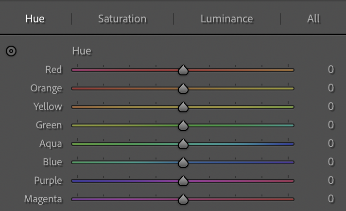
HSL sliders panel is where I try to achieve color harmony, also where I try to get closer to the visual pleasure and color consistency goals. Here I shift hues around carefully, to ensure the ones that stand out are still perceptually accurate.
Here are the things that I usually do:
- Hugely desaturate the hues that we don’t want to see much — the ones that break the harmony.
- Also shift them around to reduce the number of possible colors.
- Only lightly desaturate the hues that we keep around.
- Selectively darken (reduce the luminance) some hues to improve contrast.
Since I need to make the skin colors pleasant, I need to be careful in shifting hues that are typically dominant in skin: orange, yellow, and red. Orange hue is where the majority of skin color comes from, so I’ll use it as the anchor hue.
Red
- H: +10 to +20
- S: 0
- L: 0
The red hue needs to be slightly shifted towards orange. I need it to stay perceptually red, so only shift the hue a bit.
Orange
- H: 0
- S: 0 to -10
- L: -5
The orange hue is my anchor hue, so the hue stays at 0.
In most situations, I set the saturation at 0. In some other situations where the orange hues are coming too strong, I reduce it up to -10.
The luminance usually stays at -5, because my curve settings boost mid tones and highlights. Those are where most visible orange hues lie in my subject’s skin, and I need to ensure they are not too bright.
Yellow
- H: -20 to -35
- S: -15 to -25
- L: -15 to -20
I want the yellow hue to be more orange-y, but I don’t want it to be orange. The values I specified above should still give a somewhere-in-between look.
Desaturation of the yellow hue is necessary because I want limited yellow colors in the scene. I also darken it more so that it is coming weaker than oranges and reds.
Green
- H: +20 to +30
- S: -30 to -50
- L: -30 to -35
The green hue is something that can come off too strong. The green hue makes skin tones look weird, and this is especially apparent when you’re shooting a person close/under a lush tree, or in a forest.
The green then needs to be desaturated quite heavily to have less impact on skin tone. However, to maintain its ability to portray lush and calming leaves and trees, I shift it towards aqua. Then I would darken it down to improve contrast.
Aqua
- H: +20 to +40
- S: -20 to -30
- L: -10 to -20
Like the blue hue, the aqua hue has a lot of presence in body of water or in the sky. Since the sky is usually brighter than the ground, I set the luminance down.
To achieve better color consistency, the aqua hue is shifted to blue so that they both meet somewhere in the middle. It is then slightly desaturated.
Blue
- H: -15 to -20
- S: -20 to -30
- L: -10 to -20
The blue hue receives a similar treatment like the aqua hue. The difference is the hue shift: it is shifted towards aqua.

Purple
- H: -35 to -100
- S: -30 to -80
- L: -10
Like the green hue, the purple hue is a difficult one. I find it hard to blend the purple hue in to the color palette I’m trying to achieve, especially when the color is prominent.
The purple hue is present mostly at the beginning of the blue hour.
Magenta
- H: +20 to +30
- S: -20 to -30
- L: 0 to -5
The magenta hue sometimes subtly appear in the sky and skin (particularly b blood veins). I would shift them towards red a bit.
Use Color Grading / Split Toning

I love this Color Grading tool. It can help improve color contrast subtly. This tool can also improve consistency: if we apply the same split toning to the a set of picture, we will see a more uniform result.
What you can do with this tool is introducing color tint in 3 separate tone areas: shadows, mid tones, and highlights. You can determine the color and the saturation / intensity of the tint of each area individually. In newer versions of Lightroom, you can also change the luminance value of each area as well.
Your next question might be, “Which color combination should I use? How should I use the?”
Good question. Let’s pick a set of colors that:
- Improve color contrast
- Work well with skin tones
- Appear subtly yet noticeable enough
To achieve that, I went to Adobe Color and use the tool to get the set of colors. The choices of colors that work for me is represented here:
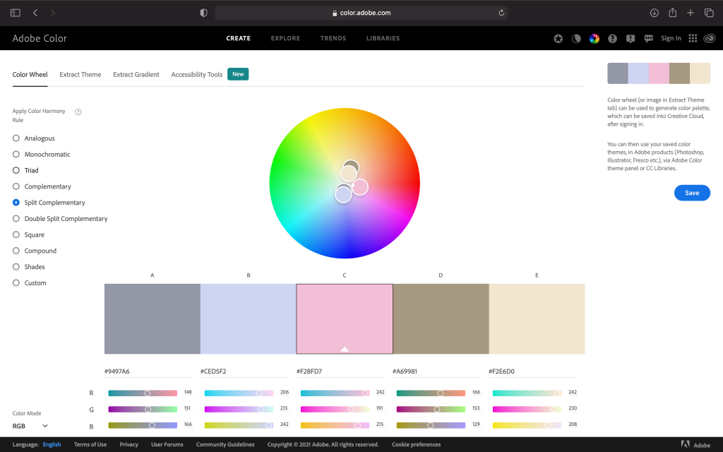
Since the rotation of the color wheel in Adobe Kuler and Adobe Lightroom is different, I needed to approximate the color values in Lightroom. I am not sure if I get the numbers correct, but they seem to work.
Below are the values. :
- Highlights: 310 (saturation 4)
- Mid tones: 40 (saturation 2)
- Shadows: 190 (saturation 4)
How subtle is the tint that I apply? See here.


As you see above, the tint saturation values are good enough — It shows the tints subtly. However, if you’ve been following the instructions in this article, and you feel like you need more presence, feel free to add more saturation to the values.
That’s what I can share in this article.
If you get insights from this post, you have a few options to react:
- buy me some coffee in real life, or on the internet,
- share your thoughts in the comment section below,
- slide into my DM to give me a high five.
